Introduction
ItemPath was founded in 2017 by a father-and-son team who wanted to improve how warehouse data was stored and integrated with other systems. Their solution, the ItemPath software application, offers features like reporting and a REST API to connect PowerPick with business management software.
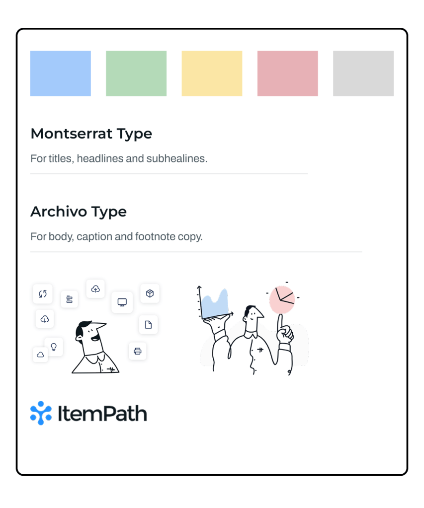
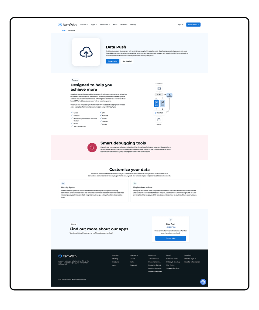
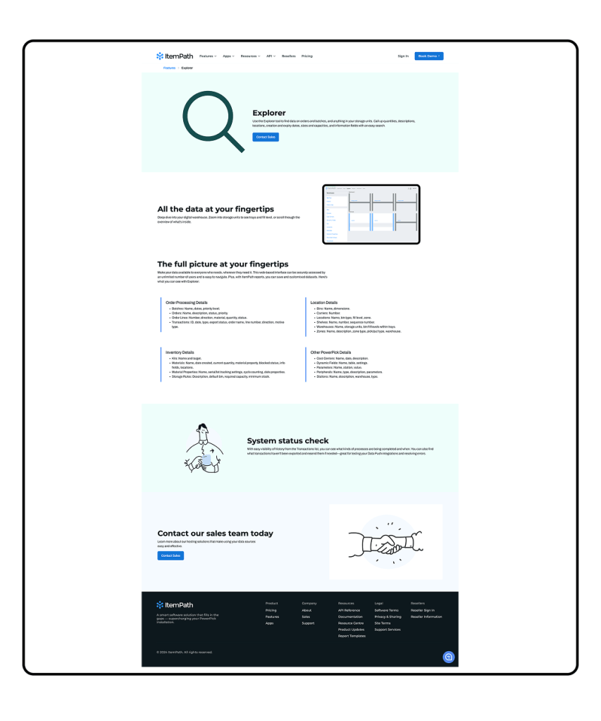
The original brand design featured blue, green, yellow, and red, with a light and “beachy” feel that didn’t align with the inventory management industry. It also relied heavily on illustrations, making the site feel outdated. As the company sought to modernize its image, I was brought in as a UX designer to help update their brand. The initial project aimed to refresh their colour palette and design a case-studies page within a six-week timeline.
Project Goals and Objectives
The goal of this project was to update ItemPath’s brand and create a color palette that felt more mature and professional in the warehouse inventory management space. A key objective was to ensure the new colors were AAA compliant, meeting high standards for accessibility in web design.
The company wanted a flexible colour system that could be applied to both their corporate website and later extended to their software platform. The colours needed to work seamlessly within the software’s interface.
Additionally, the team requested that the new branding be easy for developers to implement. I would create a set of components that could be adopted with minimal effort, ensuring a smooth transition without a significant time investment from the development team.
Research and Discovery
To inform the updated brand, I researched companies with similar platforms and integration models. One key inspiration was Vanta.com, a security and compliance platform with multiple integrations. Although not in the warehouse management space, Vanta’s platform and integration structure were similar to ItemPath’s. Their brand featured bold colors and design elements with motion and organic lines, offering a more mature alternative to ItemPath’s original “beachy” vibe.
Another inspiration was Linear.app, which had a bold, darker style and a clear, easy-to-read layout. This approach helped shape how ItemPath’s new color system could remain readable while being visually engaging.
A third reference was ClickUp, which had a lighter, cleaner branding style. Their integrations page was easy to navigate and served as a useful model, as ItemPath also has multiple integrations that need clear presentation.
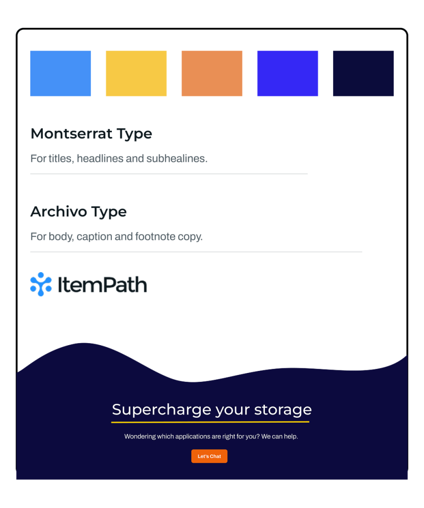
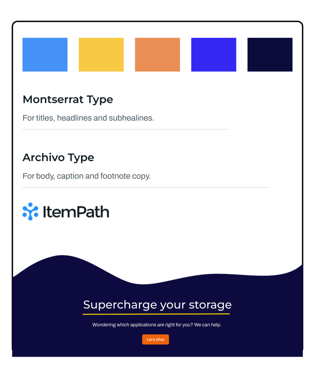
The original logo Blue (2491FF) was kept as the base colour, while introducing bold, complementary colours to replace the previous light hues. This would create a modern colour palette that aligned with the company’s professional identity.

Colour Theory and Strategy
The new colour palette would create a bold and professional look while maintaining accessibility and harmony with the original ItemPath logo blue. To start, I wanted to introduce a dark background colour that wasn’t black but still complemented the blue. After testing a few options, I settled on a very dark blue (0C0A3E). This choice allowed the design to stay within a monochrome range while providing a bold, strong background option.
To add contrast and vibrancy, I introduced a complementary yellow (FFC800). This bright yellow would pop against the dark blue background, providing a striking visual without overwhelming the design.
Next, I wanted a third bold colour that could be used for headings and calls to action (CTAs). Initially, I experimented with different shades of orange, which paired well with the blue tones. However, many of the oranges didn’t offer enough contrast against white to meet accessibility standards. After testing several orange values, we landed on (F3772B), which was both visually appealing and met the contrast requirements for readability and accessibility.
Design Process
During the design process, I tested the new color palette in a sample case study design. While the colors were more professional, the design still felt flat. To add more visual interest, we introduced a vibrant blue (3F0FFF) for headings. This stayed within the monochromatic scheme but added contrast and energy.
The yellow (FFC800) worked well as an accent color, especially for lines and borders, helping sections stand out and improve readability.
The original Logo Blue (2491FF) only met accessibility standards for large text but was used as a background color for pull quote sections to break up long text on the case study pages.
We also tested additional accent colors, including an aqua shade, but they didn’t meet the accessibility goals and were removed from the palette.
The process involved testing and adjustments to ensure the colours created a professional identity while meeting accessibility standards.

Final Design Solution
The final colour solution included a refined palette that aligned with ItemPath’s new identity. I added movement elements to break up the straight horizontal lines, settling on a wave-shaped SVG for use across headers and footers. Vertical yellow bars were also used to help sections stand out in cards and headers.
I delivered a case study mockup in Figma with the new colors and sample content. I also created three new card components to support future pages and included the new brand color palette for easy implementation.
The final design combined bold, accessible colours with dynamic elements, creating a modern, professional look while maintaining clarity and usability.

Results and Impact
The design work has been passed off to developers for implementation on the website. The colour palette will also be extended to include warning, error, and success state colours for use in the application, ensuring consistency across both the website and software platform.
The result is a unified brand identity, informed by research, that can be applied consistently across all marketing and software assets.
Leave a comment